
NITA
CATEGORY: Branding & packaging
SOFTWARE: Illustrator, Photoshop, Lovart
SERVICES: Design & Packaging

01. The Challenge
NITA came to SMC Designs with more than a product to package. They were introducing menstrual underwear into a market where conversations around women’s health are still often private, sometimes uncomfortable, and rarely reflected in modern branding.
The challenge was to create packaging that could build trust instantly. It needed to feel soft and reassuring without losing credibility, feminine without being cliché, and modern without disconnecting from the local audience. At the same time, it had to stand out in retail environments where most products either lean too clinical or lack identity altogether.
This wasn’t just about aesthetics. It was about positioning a new kind of product in a way that women could immediately understand, feel comfortable with, and choose with confidence.

02. The Solution
SMC Designs approached the project by focusing on one core idea: turning a functional product into a self-care experience.
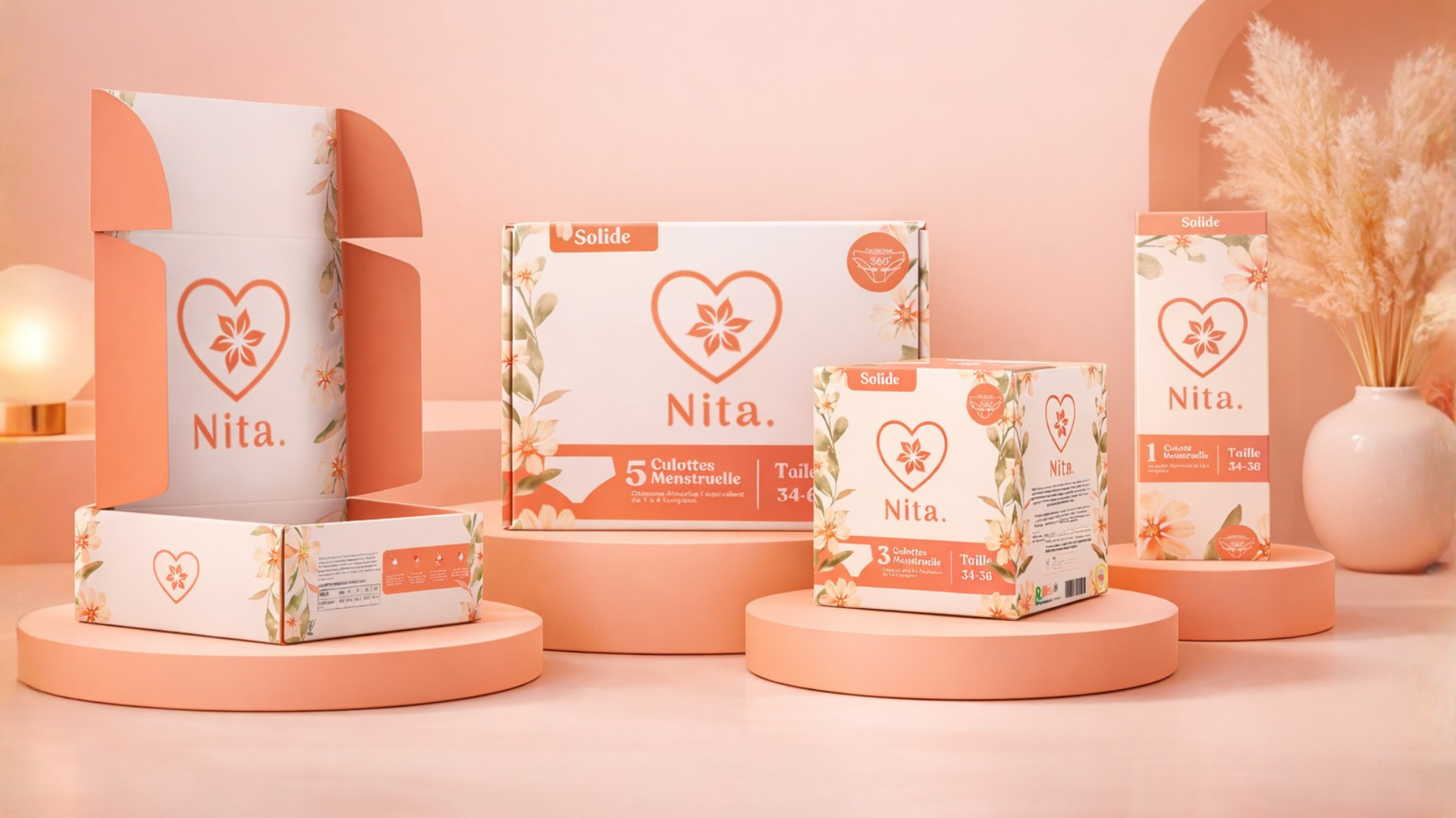
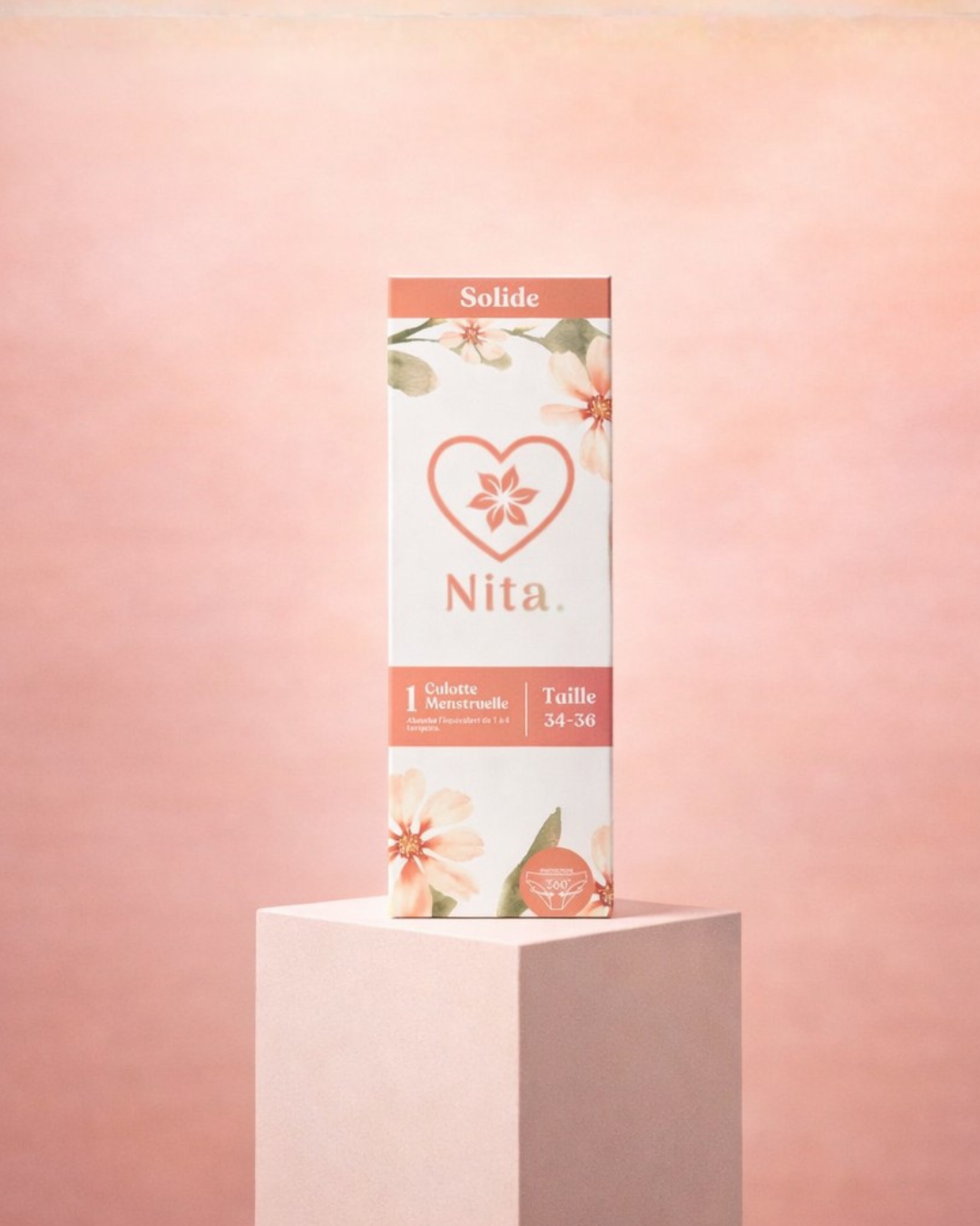
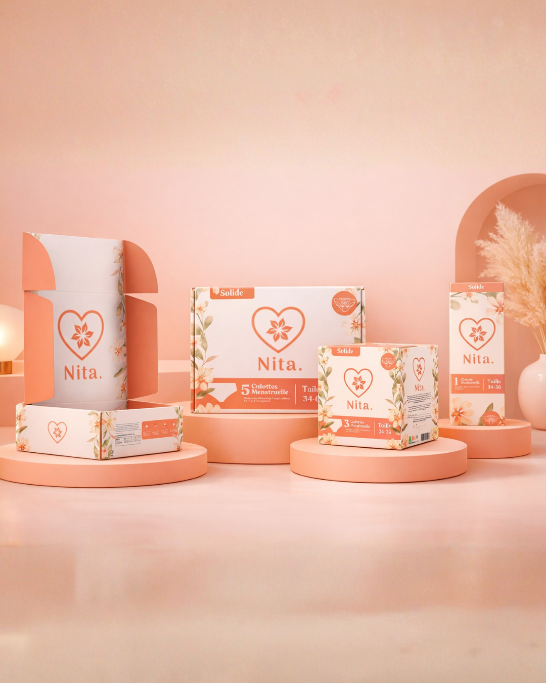
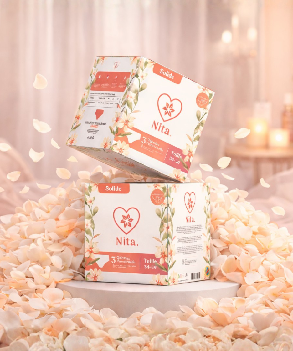
The visual direction was built around warmth, softness, and emotional clarity. Floral elements were introduced to create a sense of calm and familiarity, while a refined color palette helped position the brand as both gentle and premium. The goal was simple: when a woman sees the product, she should feel reassured before even reading a word.
At the same time, structure played a key role. The layout was carefully designed to make essential information clear and accessible. Sizes, product types, and quantities are easy to understand at a glance, reducing hesitation and making the buying decision effortless, whether in-store or online.
Every design choice was intentional. The balance between softness and precision allows the packaging to communicate two things at once: emotional comfort and product reliability. This duality is what gives the brand its strength.
03. The Result
The final result is a packaging system that does more than present a product. It defines how the brand is perceived.
NITA now stands as a modern, trustworthy, and women-centered brand in a category that often lacks emotional connection. The packaging creates a strong shelf presence while remaining elegant and approachable, helping the product feel both premium and accessible.
Beyond the visual impact, the design supports real business growth. It works seamlessly across retail and e-commerce, reinforces brand recognition, and most importantly, helps normalize a product that deserves to be seen as essential.
This project is a clear example of how thoughtful design can shift perception, build trust, and turn everyday products into meaningful brand experiences.


This is a useful post for finding broken links within the website, what about links pointing outwards that are broken? I can use a free web service but wondered if this was possible.
Great tool! I am using a redirect plugin to send all my 404’s to my home page but I think it’s slacking sometimes.